Edited by: Beste Sabir
Proofreading: Bianca Baroni
Where: 13th İstanbul Biennial, Istanbul
Artworks: Lava Design
Beste Sabir: 13th İstanbul Biennial has chosen the topics such as literature, politics, public and the term “barbarian”. How did you interpret and relate the graphical design works to these terms?
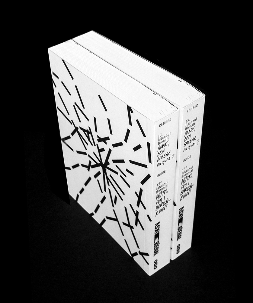
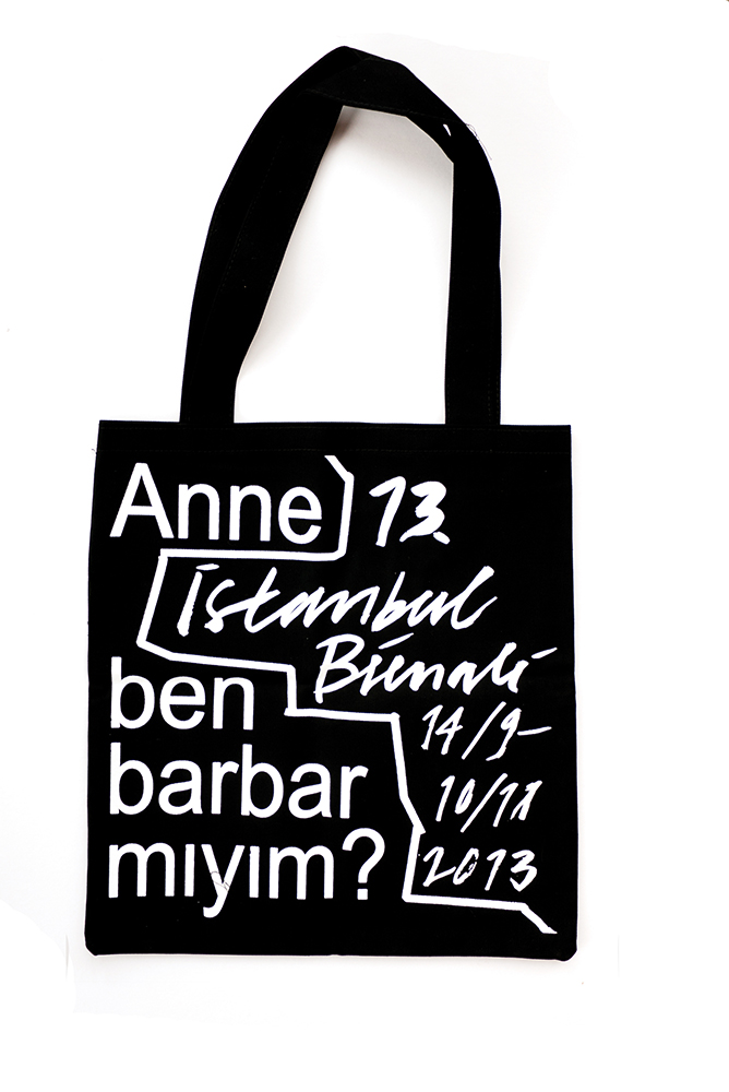
Ruben Pater: This idea about languages we use in public, we took that as a starting point to think about how this can translate into a language. So the idea that we started was always to use these two languages: Turkish and English. Also there’s this idea about the barbarian. It’s a sound word that comes from Greek, if they can not understand you, they would say barbarbar. We developed languages parallel with the question of how can we understand each other better in public space. And we wanted to show that battle of space. Like in the street; one person draws within his language and then other person writes in their language in the left space: Battle for space on every posters, also in the website. This is how we started.
BS: And then the Gezi Park protests started. The reality overlapped with the concept of the biennial as a coincidence. How did this process effect your design?
RP: Before the biennial we have been working on the concept for many months. After the protests, many things changed. Different artists, different art works, venues, different kind of shift in the curatorial framework. A little bit of shift more towards language and less about space. Not so much about the battle of space but more about the public and maybe a bit more open design.
BS: What does these forms and typologies mean in the graphic works?
Hans Wolbers: Public is moving around constantly, that’s why the dynamics of those lines are everywhere.
RP: First the lines were closed, like borders or putting a wall. If you cut up the wall, it becomes element, the element become public art. People are moving actually but how people can come together? And I think it’s now this is really now trying to communicate.
BS: Did you use new techniques during design of the graphics as well the web site?
RP: Yes we used a CSS Plugin in web page. If you talk about the movement of space, a static website makes no sense, it should be dynamic. So the web site is like the series of blogs, like a wall. Every part of the wall can open up for the content, you have small or bigger screens. I think that’s a good example where you see the behavior of the idea.
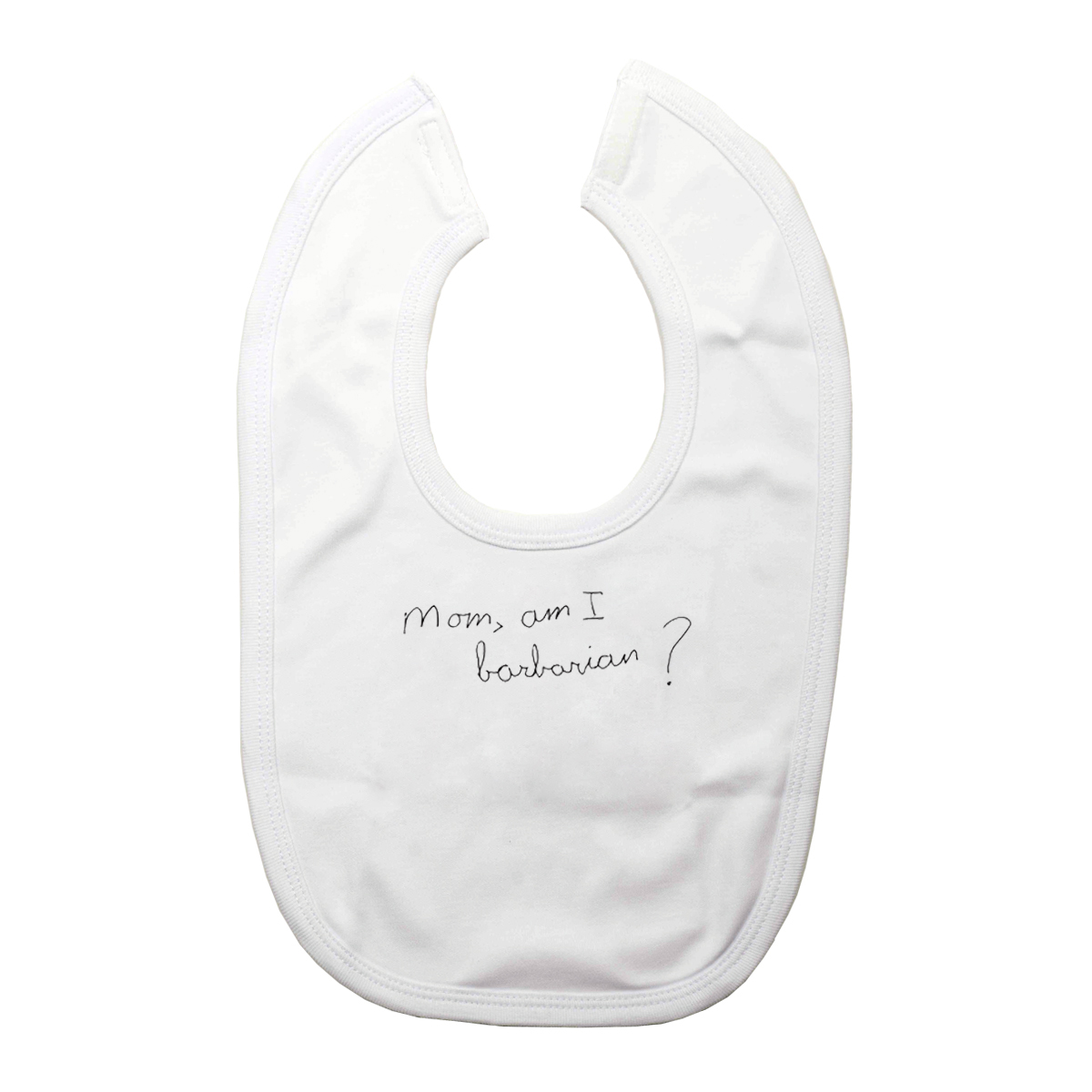
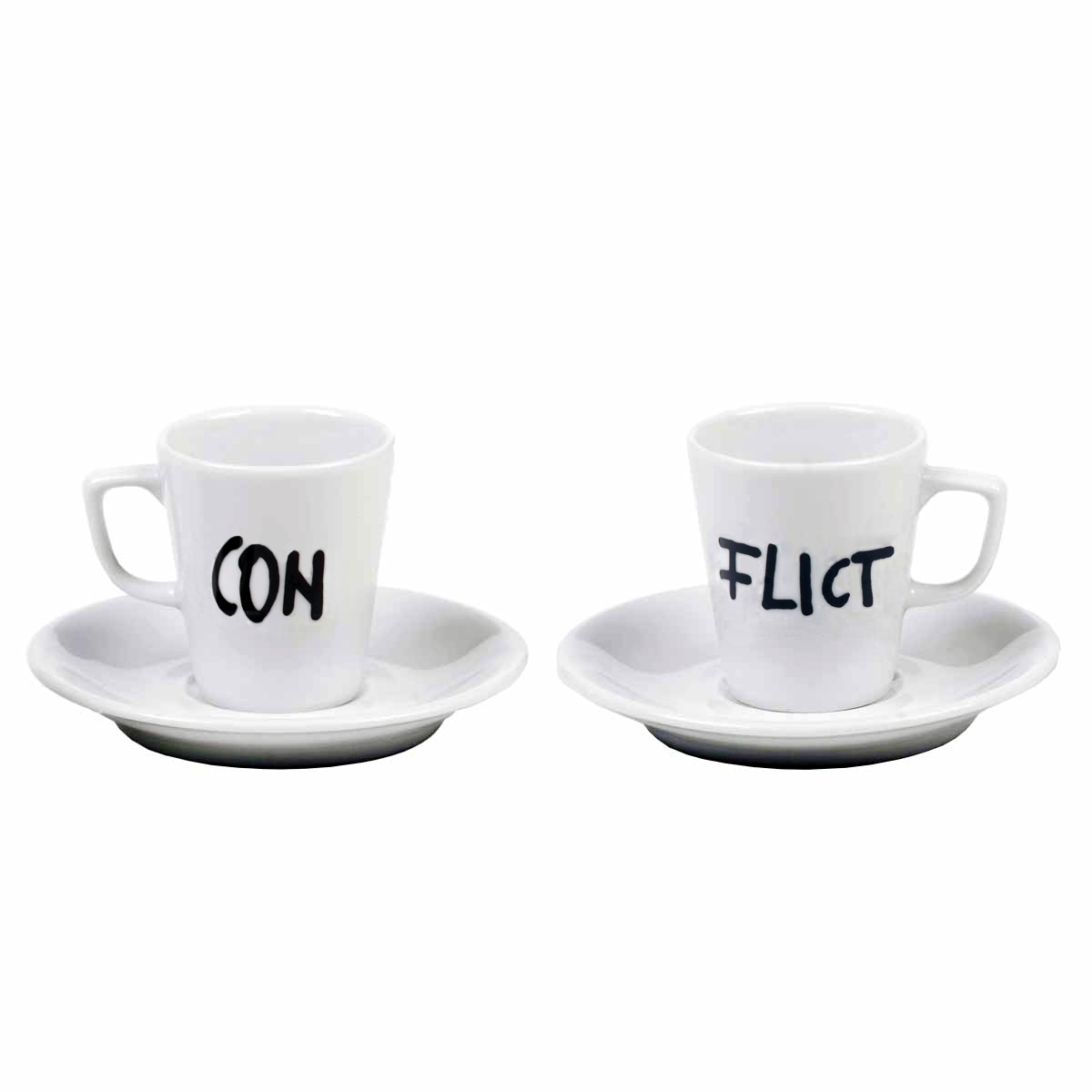
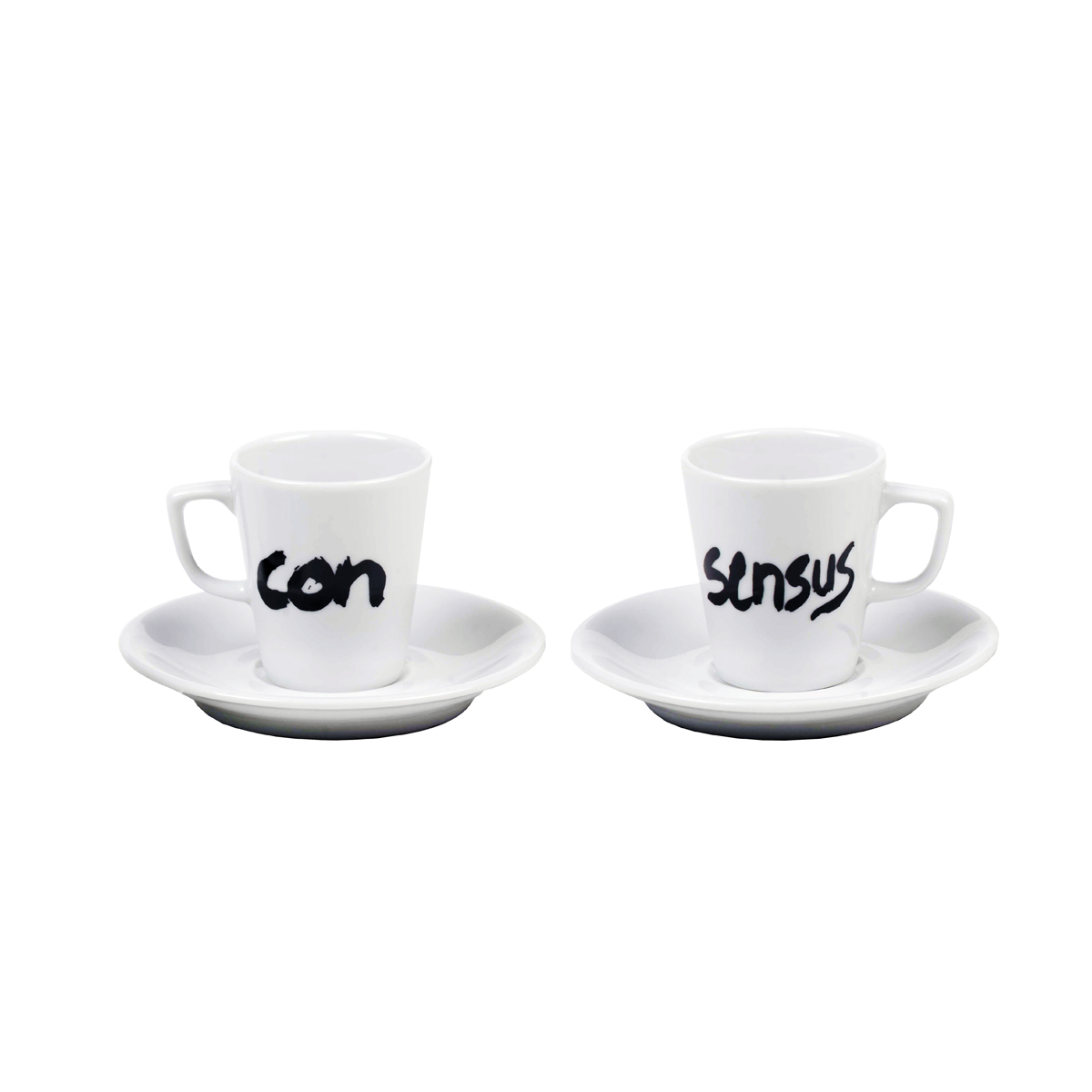
HW: This is talking about the dynamics of the identity design. For instance two coffee cups: Yes we could put the logo on the same products, it would make it meaningful. But now it becomes a dialog. Every item that we make whether it’s a movie, website or whatever, we go back to the key concept and try to tell something in every item that we made. It’s also the thinking of everything you make, what we can add as a story to the item that we make. Every item, we are not trying to put the visual identity on it but were trying to create something that makes it challenging for the viewer and people to respond it.


