By Roberto Lucchese
Photos by Max Lerouge
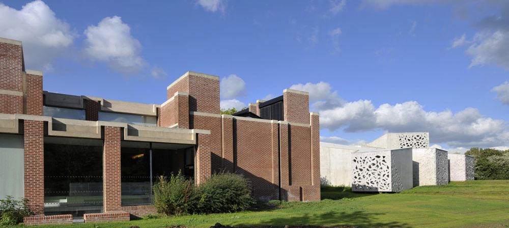
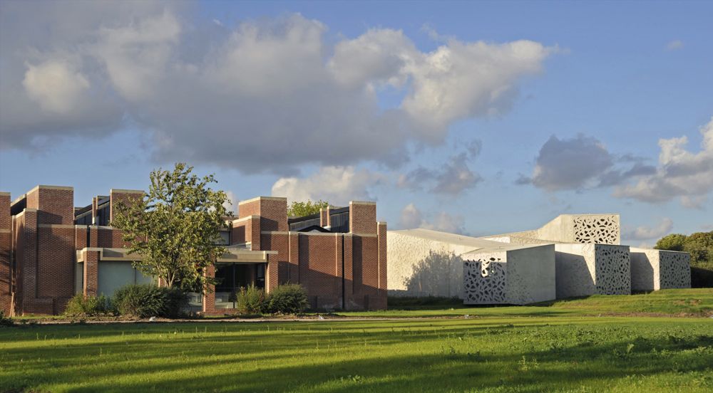
“In spite of the heritage monument status of Simounet’s construction, rather than set up at a distance, we immediately opted to seek contact by which the extension would embrace the existing buildings in a supporting movement. I tried to take my cue from Roland Simounet’s architecture, ‘to learn to understand’, so as to be able to develop a project that does not mark aloofness, an attitude that might have been seen as indifference.” [Manuelle Gautrand]
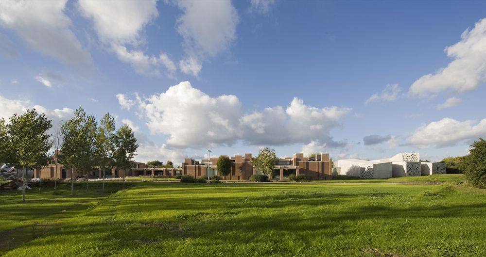
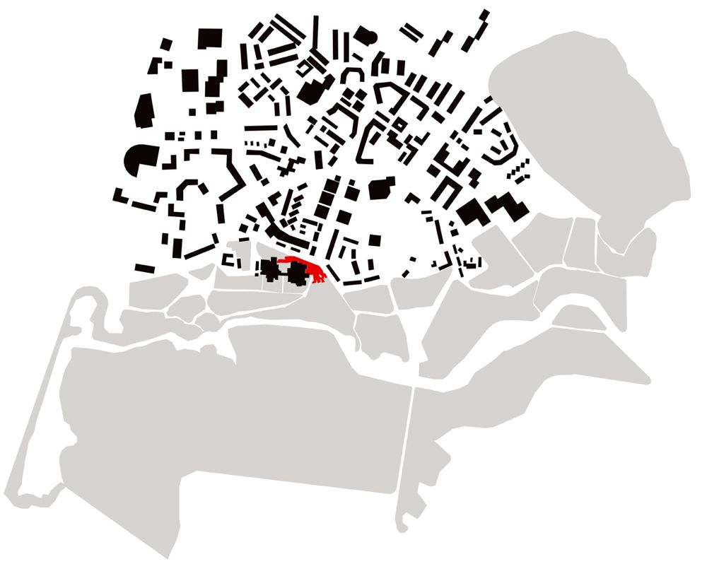
The project concerns the refurbishment and the extension of the Lille Modern Art Museum in a magnificent park at Villeneuve d’Ascq. The existing building, designed by Roland Simounet in 1983, is already on the Historic monuments list. The project aims at building up the museum as a continuous and fluid entity, this by adding new galleries dedicated to a collection of Art Brut works, from a travelling movement that extrapolates existing spaces. A complete refurbishment of the existing building was next required, some parts were very worn.
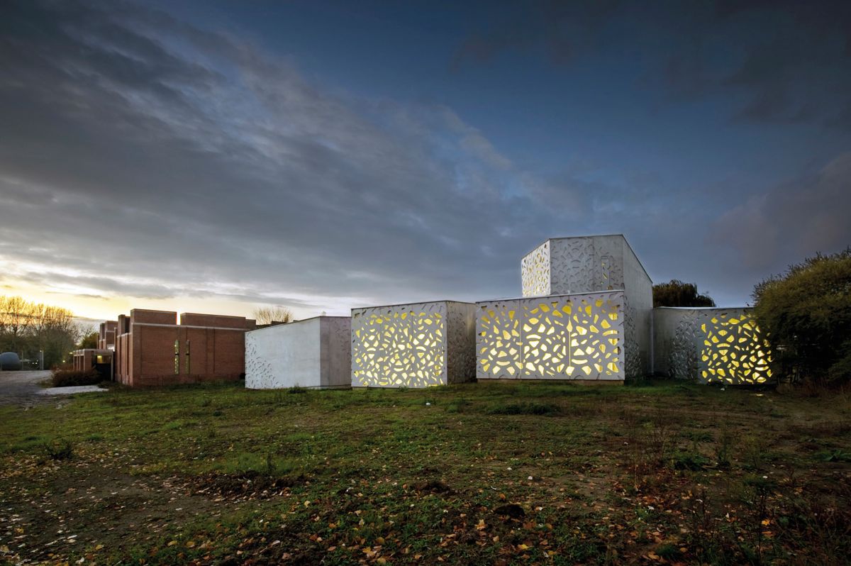
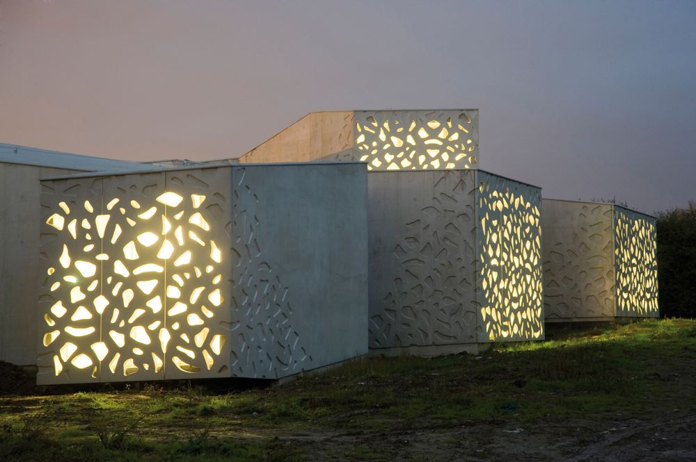
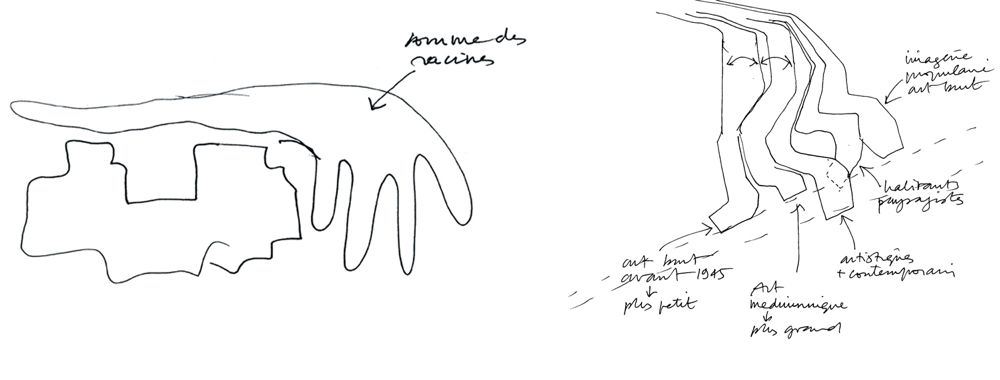
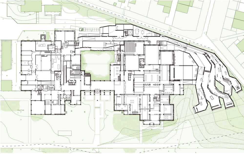
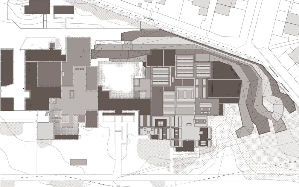
The architecture of the extension wraps around the north and east sides of the existing arrangement in a fan-splay of long, fluid and organic volumes. On one side, the fan ribs stretch in close folds to shelter a café-restaurant that opens to the central patio; on the other, the ribs are more widely spaced to form the five galleries for the Art brut collection.
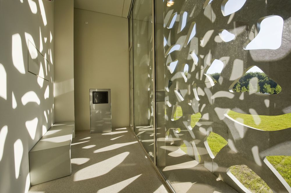
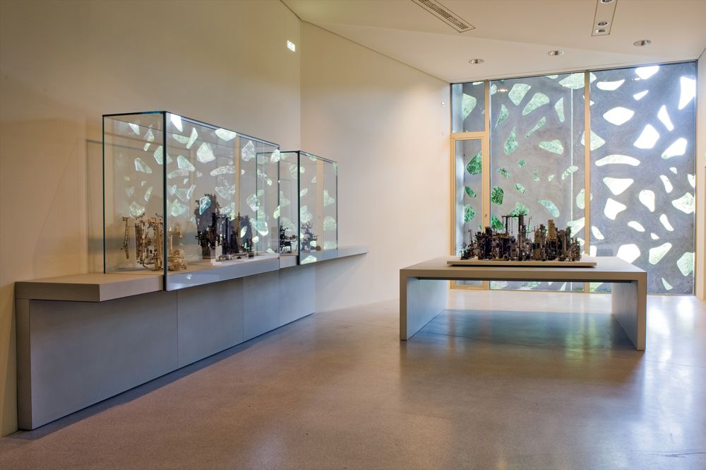
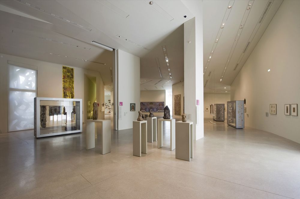
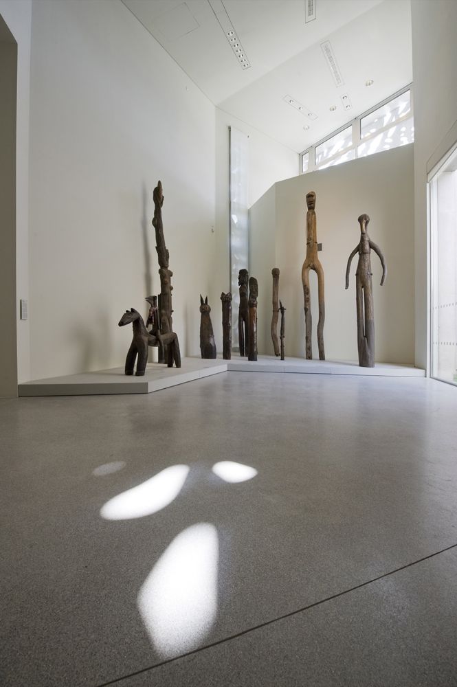
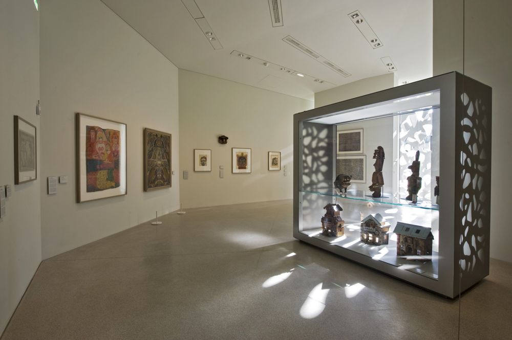
The Art brut galleries maintain a strong link with the surrounding scenery, but they are also purpose-designed to suit the works that they house: atypical pieces, powerful works that you can’t just glance at in passing. The folds in these galleries make the space less rigid and more organic, so that visitors discover art works in a gradual movement. The architecture is partly introverted, to protect art works that are often fragile and that demand toned down half-light.
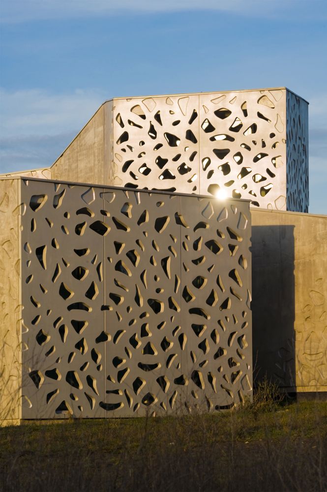
At the extremity of the folds – meaning the galleries – a large bay opens magnificent views onto the surrounding parkland, adding breathing space to the visit itinerary. These views make up for the half-light in the galleries: the openwork screens in front of the bays mediate with strong light and parkland scenery, a feature that recalls Simounet’s generous arrangements in the galleries that he designed. Envelopes are sober: smooth untreated concrete, with mouldings and openwork screens to protect the bays from too much daylight. The surface concrete has a slight colour tint that varies according to intensity of light.
Sketches
Site Plan
Plans


