Architects: Yi Architects
Where: Stuttgart, Germany
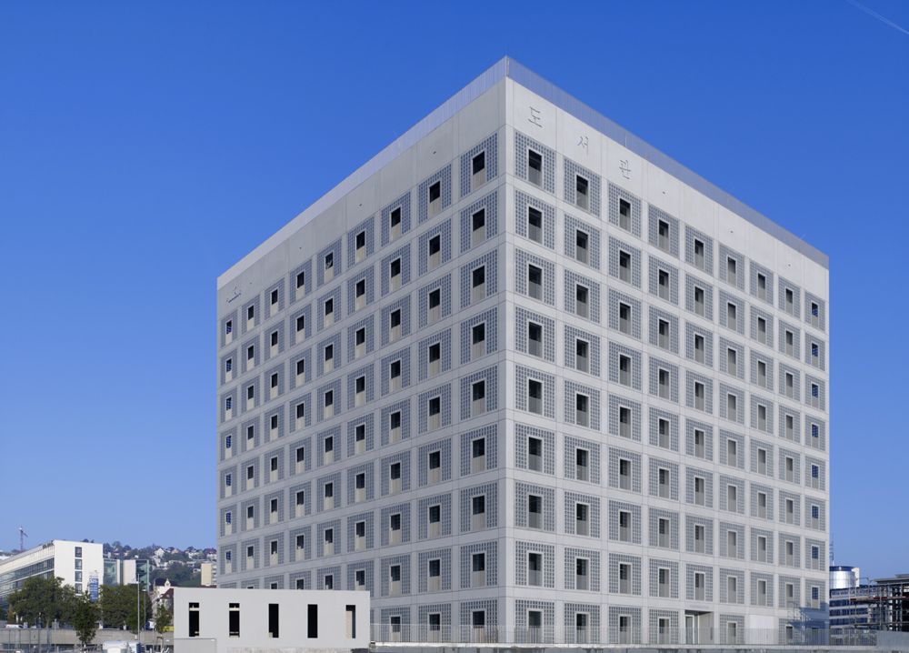
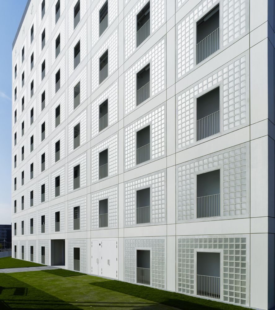
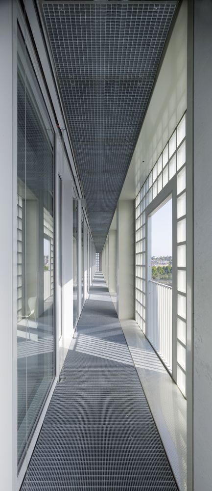
The location chosen for the new building was the central, slightly sloping plot in the middle of the area demarcated by the master development plan for the European Quarter. This area in the basin of the city reaches from the main station in the south to Heilbronner Strasse on the northern border. In future, Stuttgart City Library is located in Mailänder Platz and, thanks to its design and size, represents the centre of the city district that will emerge there. The external effect of the structure of pale grey fair-faced concrete and frosted glass bricks planned in the geometrical form of a cube with an edge length of almost 45 metres comes through its sheer physical presence.
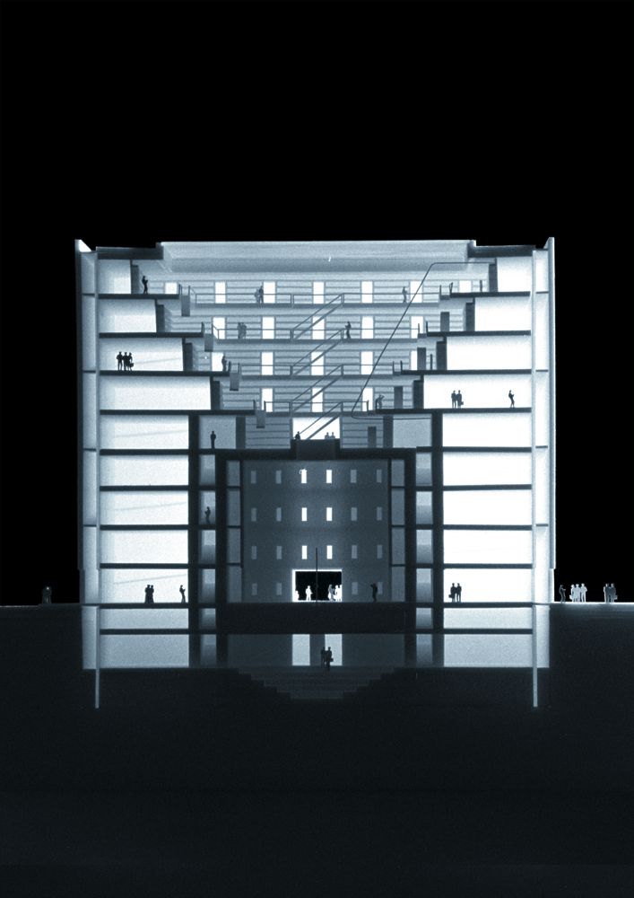
The building consists of volume, shell and core. The circulation is contained in the gap.
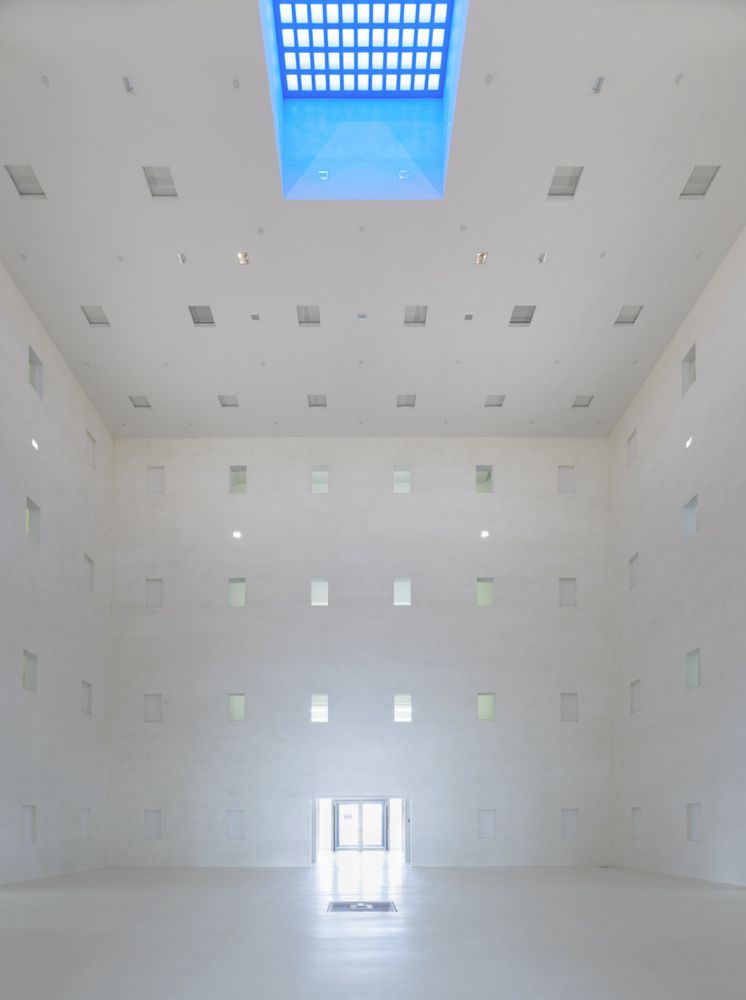
While the structure with its decisively clear, geometric form and focused entrance was inspired by the “Cenotaph for Newton” by Étienne Boullée, the “Heart” of the library reinterprets the ancient pantheon in light of our changed technical reality. It is quasi enclosed by a second façade and as cubeshaped room is situated at the middle of the building, illuminated by a central roof light. A room to retreat to.
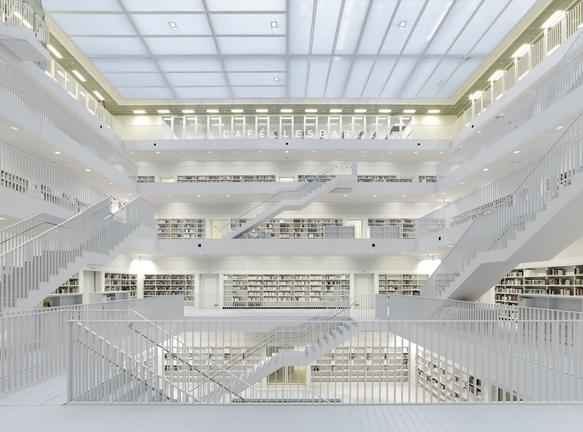
Its oculus is in the funnel-shaped reading room above it. The staggered Galeriesaal (gallery hall), by contrast, is an age-old type of room which architects have picked up on again and again, such as the design by Étienne Boullée for the French National Library from 1785. Now, it has been realised in a contemporary way, in a compact, square shape and as a five-storey room with a shell of books, so that for once one can truly experience a realm of books. The spirally arranged, interior circulation stairs in the reading gallery levels have been designed as flowing promenades. Light floods in through the glass roof. On the inside, the glass roof is closed off with a grid-work drop ceiling so that the room is perceived to be even simpler and purer. On the outside, the glass roof is also closed off, in this case with sun protection blinds so that the structure is a perfect cube.
The third central room is located below the “Heart”. The “Forum”, which was originally staggered towards the middle, is now a level event room due in part to the light-railway line that crosses in the first and second basement floors and also at the request of the user. The result is a flat, square room which completes the theme “morphosis of the square room”. The whole structure liberates itself from the flat, square room via the perfect cube into a room which dissolves itself towards the top.


