This week we featured a new young photographer: Mike Bailey Gates from USA. Feel free to leave your comment and open a discussion about Mike’s photos. I think he’s another good one young photographer. This is our philosophy and we keep on looking for young talent to publish.
GC- Editor
Mike Bailey-Gates was born in 1993 in Rhode Island, USA. He grew up in a small town surrounded by woods, and it was here he became interested in photography. He was always interested in art and always enjoyed art classes is elementary school and had a love for all things creative . At the age of thirteen he began taking photographs of the landscape in his surrounding countryside and over time the hobby progressed into a passion for portraiture and fashion. He goes to high school and enjoys long car rides at night with his friends. Michael is currently living in New England with his family and working as a represented photographer.


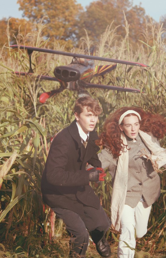






I love the North by Northwest tribute, very clever.
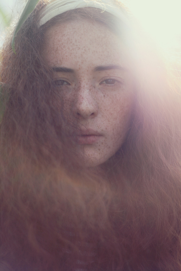
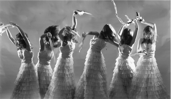
I don’t really understand why so many budding photographers are intent on processing photos to appear “vintage”. I wonder if this style is going to hold up in 5, 10, 20 years, or if it (more likely) will look hackneyed like color reduction or overprocessed HDR.
Cross-processing or desaturating and vignetting don’t hide the fact that highlights are blown, or that eyes are out of focus in a portrait.
In this case, speaking about Mike’s photos, we selected it because we think that the photos are good to show, and i like this kind of style also because it’s not the first time that we look for this kind of photos.
You are always speaking about tecnique, but here we just look to the final image. I think if there are mistakes sometimes in much better than a “perfect” photos, but maybe without a soul. Maybe he liked this effect, and it’s what we like too.. If you don’t like this kind of style it’s ok, but i can’t understand when you comment those photos everytime with a tecnique-critic eye, and without looking to the final image and what he wanted to communicate.
I think that’s a valid question, and sorry if I sound overly critical.
In these cases, I think that the technique is overshadowing any message that the actual image may hold. I don’t see the technique as part of the final product, but apart from it. Changing the color tone of an image does not, to me, actually say anything. And it’s all too common for people to use these techniques as tricks to cover up substandard work.
Not that I’m saying this is what’s happening here but take the third photo, the profile portrait. The subject’s eye is out of focus, but her hair is in focus. Maybe there is some irony I’m missing here, but it looks like a pretty basic error. The effects added afterward do distract from that, but once it’s noticed, it feels like they were added only to do just that. I feel like I’m trying to be hoodwinked.
Then again, I’m only one person, and it’s not like I put material out there that’s above criticism (far from, in fact). And seeing these young photographers showcased is inspiring, simply because they show so much promise.. But I don’t see much in these examples that’s fresh or that shows a vision beyond “it’s cool when I do this in photoshop”. As always it’s your blog, you post what you want, but putting these things in public also means you open yourself to being critiqued by that public. If you don’t like it, don’t allow comments on posts or delete comments you don’t appreciate. In any case, I wish Mike the best, it seems like he’s working on developing his vision which is the best any of us can do, and he has plenty of time ahead of him to do so. I’m sure he’ll go on to make an impressive mark.
Your critic seems like the same one that was douring the ‘800. The painters refused photography as art, now you are refusing digital retouching as art. This is the same.. but as we know in the ‘900 the photography was aready accepted and diffused. And i don’t think if that someone decide to keep on focus somethind different as a face they produce irony or other things.. it’s just a personal way to see it.. you didn’t get it. I’m open always to costrucitve critics.. and if you post your critic you should be open to recive a critic too!
B- you are very annoying. i looked at your flickr page and yeah, you may have good “technique” but you have no artistic ability whatsoever. i suggest you find another website to share your opinions because really they are not relevant here.
I agree.
Thanks folks, as I said I don’t have work that is above criticism. I do the best I know how with what I have. I’m welcome to any more specific criticism that’ll help me, as I gave. “Very annoying” is not really a valid criticism, unfortunately. If you don’t appreciate my style, well that’s fine, that was my original critique anyway, I can live with that. If anyone has any input that they’re not willing to share in this public forum, my contact info can be found via the link I provide here; I’d love to hear from you.
Also: S, I’d be interested to hear exactly why you find my photos (1500+ of them) to be devoid of artistic merit, but your comment is anonymous with no link… please feel free to comment here about that or get in touch with me personally (again, my contact info is linked from these comments). Thanks.
Sorry but your photos are so incredibly boring. A flower here, a tree there. things we’ve all seen a million times. perfect technique is so very boring and uncreative. why not think out of the box?
I appreciate that; I never thought I had perfect technique or anything close to it, so I guess I’m on the right track. Cheers!